unicode · guides · platforms
Gothic vs Blackletter vs Fraktur
Gothic vs blackletter vs fraktur: which term matches Unicode output, which style survives Instagram bios, and where platform fonts break blackletter paste.
Published · 1 min read
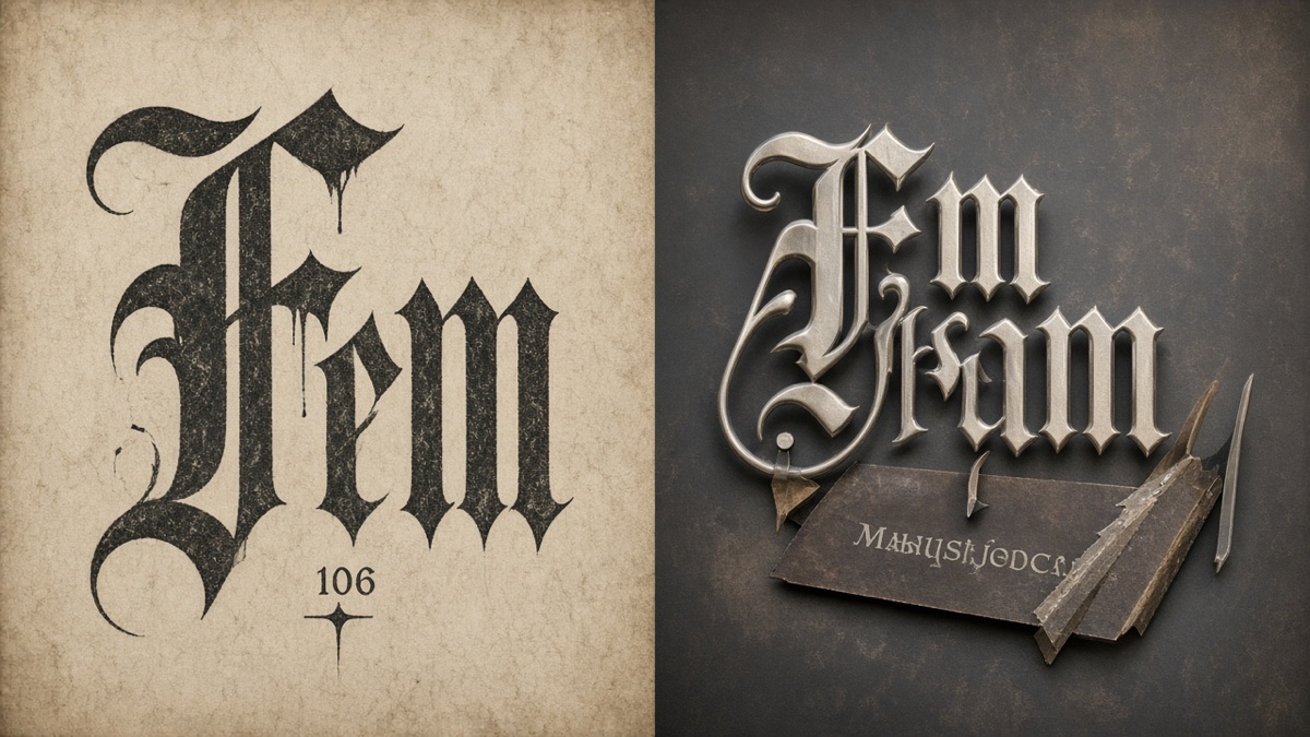
You searched for gothic vs blackletter vs fraktur because three different communities use three different words for the same dark, broken-stroke aesthetic. Tattoo artists say blackletter. Metal band mockups say gothic. Math notation charts say Fraktur. The Gothic Text Generator maps your phrase to Mathematical Fraktur Unicode, not a scanned historical specimen.
Unicode copied the math name and left five capital holes in the alphabet. Same vibe. Different contracts. This comparison sorts the historical terms from the Unicode blocks, then ranks which style survives real platforms when font fallback kicks in.
What is the difference between gothic, blackletter, and fraktur?
Blackletter is the typographic family: high contrast, angular strokes, dense texture, built for manuscript and early print culture across Europe. Fraktur is one branch inside that family, the German variant that dominated printing from the 16th century until policy pushed Latin type in the 20th century. Gothic is the loosest term. In font shops it often means a heavy Textura or Old English display face. On social platforms it usually means "make my username look medieval," which generators satisfy with Mathematical Fraktur Unicode rather than a font file.
When you copy blackletter text from a generator, you are not downloading a typeface. Each letter becomes its own code point in the Mathematical Alphanumeric Symbols block. The receiving app picks whichever font on the device covers that range. That is why fraktur paste can look perfect in Discord on your laptop and patchy in an Instagram bio on a phone: different font stacks, same string.
How do gothic, blackletter, and fraktur compare on readability and platform fallback?
Gothic as a search label points you toward generator output, usually standard or bold Mathematical Fraktur. Blackletter as a typography term describes the visual tradition those Unicode blocks imitate, including styles Unicode never encoded at all. Fraktur is both the historical German substyle and the specific Unicode range starting at U+1D504 for capitals. Readability and fallback risk depend on which Unicode block you paste, not which historical name you prefer.
| Dimension | Gothic (generator label) | Blackletter (typography) | Fraktur (Unicode block) |
|---|---|---|---|
| What it refers to | Casual name for dark medieval-looking paste text | Umbrella family: Textura, Rotunda, Schwabacher, Fraktur | German substyle; also U+1D504 through U+1D537 standard Fraktur capitals |
| Unicode source | Usually Mathematical Fraktur or Bold Fraktur | No single block; real fonts use OpenType GSUB | U+1D504 capitals, U+1D51E lowercase; five caps use Letterlike Symbols |
| Readability at 12 to 14px | Bold Fraktur holds weight; standard Fraktur thins out | Depends on the font file metrics, not paste | Hole letters (C, H, I, R, Z) can read as a different face beside true fraktur |
| Platform fallback risk | High on bio fields that normalize Unicode | N/A for font files; low fallback if the font loads | Highest on standard Fraktur because of dual-block capitals |
| Screen reader behavior | Spells letter by letter | Reads normal ASCII if styled with CSS or webfont | Same as gothic paste: one announcement per code point |
| Best fit | Discord roles, game tags, short display strings | Logos, posters, print where you control the font | Album titles, math aesthetic, thin fraktur look at large sizes |
Bold Fraktur (U+1D56C through U+1D59F) wins the fallback column because every capital lives in one contiguous block. Standard Fraktur looks more historically faithful in large type but loses coherence when ℭ sits next to 𝔞𝔟𝔠 from the main sequence.
Paste a test string through the Gothic Text Generator before you commit a bio or server name. The tool maps hole letters automatically, so CHR becomes ℭℌℜ instead of leaving three Latin capitals in a fraktur line.
Which blackletter style works best on Instagram?
Instagram keeps Mathematical Alphanumeric Symbols in captions more often than in profile bios, based on documented font-stack behavior as of September 2026. Bio editors on iOS have been reported to drop individual Fraktur code points and substitute fallback serif shapes while leaving lowercase fraktur intact, which produces a two-font username from one paste. Bold Fraktur survives slightly better because stroke weight stays legible after Instagram's downscaling.
Mechanism, not magic: apps that run aggressive Unicode normalization on save can fold compatibility characters or reject astral code points. Instagram's bio field is a tighter editor than the caption composer. Paste a three-character test line into Edit Profile before you rebuild a whole aesthetic around fraktur capitals.
Double-struck blackletter (U+1D538 range) looks hollow and math-textbook on Instagram, but it carries seven reserved capitals (C, H, N, P, Q, R, Z) instead of fraktur's five. More holes means more chances for a serif fallback glyph beside true blackletter shapes.
Which style is the most readable at small sizes?
Bold Fraktur Unicode is the most readable blackletter paste style on phone screens because every glyph shares stroke weight and block membership. Standard Fraktur is prettier at poster scale and worse at avatar scale. Real blackletter font files beat both when you control rendering, but they fail the portability test the moment you need copy-paste across apps.
At 12px, thin fraktur stems collapse into gray smudges on low-DPI Android panels. Bold fraktur stays separable. If readability is the goal and paste is required, bold fraktur is the pragmatic pick. If the goal is a Dark Souls death screen, standard fraktur at 24px or larger is the pick that looks like metal typography instead of math homework.
Which style falls back to plain Latin on the most platforms?
Standard Mathematical Fraktur falls back most often because five capitals pull from Letterlike Symbols while the rest of the alphabet stays in Mathematical Alphanumeric Symbols. A client font that covers 𝔞𝔟𝔠 but not ℭ renders CHR as a serif C beside fraktur H and R. Double-struck is worse on paper (seven holes) but some mobile stacks ship better coverage for hollow math letters than for thin fraktur.
Game clients and older Android WebViews are the usual failure points. Mechanism: if the system font stack lacks a face with Mathematical Alphanumeric Symbols coverage, the renderer substitutes the first available Latin glyph or a missing-glyph box. Discord desktop on Windows tends to keep fraktur intact. Embedded browsers inside launchers often do not.
Fullwidth retro spacing from the vaporwave text explainer is another paste path when blackletter holes frustrate you, though it changes the mood entirely. For circled letters that survive more bio editors when fraktur capitals fail, try the Bubble Text Generator. Circled capitals from Enclosed Alphanumerics carry a different fallback profile than fraktur holes.
How does Unicode map fraktur capitals starting at U+1D504?
Unicode assigns standard Fraktur capitals A through Z in Mathematical Alphanumeric Symbols, but the encoding is not a clean A-to-Z run. Capitals begin at U+1D504 (𝔸) and continue with offsets for most letters, while C, H, I, R, and Z were already spoken for elsewhere in the standard. A correct generator routes those five to U+212D ℭ, U+210C ℌ, U+2111 ℑ, U+211C ℜ, and U+2128 ℨ per the Unicode chart.
Lowercase fraktur is simpler: U+1D51E through U+1D537 covers a to z without gaps. Paste hello and every character stays in one block. Paste CHRZ and you hop between Letterlike Symbols and Mathematical Fraktur four times. That is the detail the swap test catches: you cannot describe fraktur fallback without naming those five letters.
Bold Fraktur duplicates the aesthetic at U+1D56C through U+1D59F with a full capital set and no Letterlike detours. Double-struck at U+1D538 adds hollow outlines and seven capital fallbacks. Neither is "more gothic." They are alternate encodings with different hole counts and different fallback math.
One honest limitation: Unicode fraktur will never match a professional blackletter font's kerning, ligatures, or contextual alternates. You get isolated letterforms. For a band logo, hire a type designer or license a font. For a Discord role that says DARK KNIGHT in something darker than Arial, fraktur paste is the right tool.
When paste is not enough, export a blackletter-looking tag from the Graffiti Generator with Creepster or Black Ops One and drop it into a story at 1080 by 1920. The Instagram graffiti art guide covers feed sizing. The PNG download workflow covers reuse in Canva and Figma.
I've pasted standard fraktur into an Instagram bio once and watched ℭ render serif-heavy beside lowercase 𝔞, which is when I switched to bold fraktur for that handle.
Frequently asked questions about gothic, blackletter, and fraktur
Is gothic the same as blackletter?
In typography, blackletter is the umbrella family that includes Textura, Rotunda, Schwabacher, and Fraktur. Online, gothic usually means whatever dark medieval-looking style a generator outputs, often Mathematical Fraktur Unicode. So gothic and blackletter overlap in casual speech, but blackletter is the precise historical label and gothic is the search term people actually type.
Is fraktur a type of blackletter?
Yes. Fraktur is a German blackletter substyle standardized in the 16th century and used in printing until Germany restricted it in 1941. When a paste tool says fraktur, it almost always means the Unicode Mathematical Fraktur block at U+1D504 through U+1D537, not a scanned historical specimen.
Why do some fraktur capitals look different from the rest?
Unicode reserved five code points inside the Fraktur capital range, so C, H, I, R, and Z map to Letterlike Symbols (U+212D, U+210C, U+2111, U+211C, U+2128) instead of the main Mathematical Fraktur sequence starting at U+1D504. Paste CHR and you get ℭℌℜ, three glyphs from two different blocks. That is spec behavior, not a broken generator.
Which is more readable: fraktur or bold fraktur Unicode?
Bold Fraktur at U+1D56C through U+1D59F has a complete A to Z set with no reserved holes, so stroke weight stays even at 12px on phone screens. Standard Fraktur is thinner and closer to metal album typography, but the five Letterlike fallback capitals can look like a different font beside true fraktur letters. Pick bold fraktur for bios and usernames, standard fraktur for large display type.
Does blackletter Unicode work in Discord nicknames?
Discord accepts non-ASCII nicknames and channel titles without client-side rejection of Mathematical Alphanumeric Symbols. The risk is font coverage on the reader's device, not Discord blocking the paste. If a friend's client lacks Fraktur glyphs, they see Latin fallback or tofu boxes while your copy still looks blackletter on yours.
Can screen readers read fraktur Unicode as one word?
No. Screen readers treat each Mathematical Fraktur code point as its own character. A fraktur nickname spells letter by letter in assistive audio, which is worse accessibility than a real blackletter webfont applied to normal ASCII. Use Unicode fraktur for decorative display strings, not for content that must be readable to everyone.
What to read next if blackletter Unicode breaks on your platform
- What Is Vaporwave Text
Fullwidth spacing when fraktur capitals fail but you still need retro width.
- How to Make Graffiti Art for Instagram Posts
Feed and Story sizing when blackletter paste is not enough and you need PNG art.
- How to Download and Use Graffiti PNGs
Download paths and reuse workflows when Unicode blackletter cannot carry spray texture.
About the author
Written by Alex Morgan, a front-end engineer specializing in Unicode text tools since 2019. Last updated: .
About Graffiti Generator