unicode · guides · platforms
Cursive vs Script vs Italic
Cursive vs script vs italic use different Unicode blocks. See code points, hole letters, which style fits Instagram, and which survives mobile font gaps.
Published · 1 min read
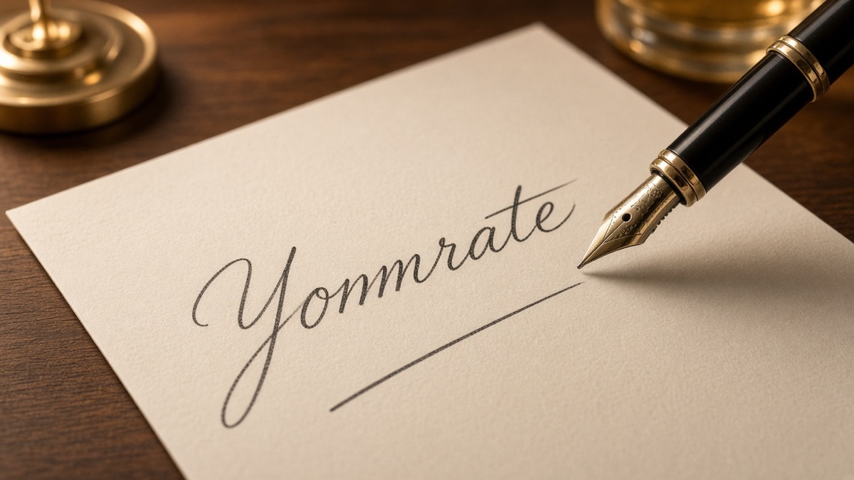
You searched cursive vs script vs italic because all three show up in bio tutorials, font menus, and Unicode generator lists, yet they are not interchangeable labels. Plain English uses "cursive" as the umbrella word for handwriting-shaped type. Unicode splits that idea into separate Mathematical Alphanumeric Symbols blocks with different code point ranges, different hole letters, and different fallback behavior on phones. The Cursive Text Generator lets you flip between Script and Italic on the same phrase before you paste.
Same input style through three maps yields 𝓈𝓉𝓎𝓁ℯ in script, 𝑠𝑡𝑦𝑙𝑒 in italic, and 𝓼𝓽𝔂𝓵𝓮 in bold script. Three distinct byte sequences. This post answers the questions people actually ask when picking among them: code points, readability, Instagram survival, and which style falls back first on phones.
What is the difference between cursive, script, and italic?
Cursive is the everyday category: any type that reads like handwriting or slanted emphasis. Script and italic are specific Unicode implementations inside that category, not synonyms. Script maps Latin letters to calligraphy-style glyphs in the range U+1D49C through U+1D4DF for capitals and U+1D4B6 through U+1D4CF for lowercase, with eleven letters redirected into Letterlike Symbols when Unicode left holes in the block. Italic maps the same A through Z and a through z into U+1D434 through U+1D467, a slanted formal alphabet with one lowercase hole at h (U+210E). Bold script (U+1D4D0 to U+1D503) and bold italic (U+1D468 to U+1D49B) add weight without changing the core script-vs-italic split. None of these are font files. Each visible letter is its own scalar value in UTF-8 text.
Typography textbooks call real cursive fonts "joined" or "connected." Unicode script is disconnected calligraphy: beautiful loops, but no automatic ligatures between letters. Italic Unicode is closer to oblique type design. You pick script when you want soft curves in a short Instagram name. You pick italic when you want slanted emphasis without eleven symbol detours.
Paste BER through script and you get ℬℰℛ, three Letterlike capitals at U+212C, U+2130, and U+211B. Paste the same three letters through italic and you get 𝐵𝐸𝑅 from the contiguous italic block. One word, two rendering strategies.
Where do script and italic code points live in Unicode?
Both families sit inside Mathematical Alphanumeric Symbols (U+1D400 through U+1D7FF in the Unicode chart), but they occupy different rows within that table. Script uppercase A starts at U+1D49C. The next contiguous capitals run through U+1D4B5 before holes force B, E, F, H, I, L, M, and R into the U+2100 Letterlike Symbols plane. Script lowercase a begins at U+1D4B6; e, g, and o exit to U+212F, U+210A, and U+2134. Italic uppercase A starts lower, at U+1D434, and runs without cap holes through Z at U+1D44D. Italic lowercase a starts at U+1D44E; only h breaks out to U+210E (planck constant glyph ℎ).
Bold script duplicates the script visual weight at U+1D4D0 through U+1D503 with a full A-to-Z and a-to-z run and no Letterlike remaps in the generator map on this site. Bold italic mirrors italic slant at U+1D468 through U+1D49B, again contiguous. Digits, punctuation, and spaces never map. style2! in script becomes 𝓈𝓉𝓎𝓁ℯ2! with plain 2 and ! trailing the loops.
The honest limitation: Unicode did not design these blocks for social bios. They exist so mathematical notation can distinguish variables in plain text. Hole letters are legacy gaps, not bugs in your generator.
How do cursive, script, and italic compare side by side?
Script favors calligraphy curves and pays for them with eleven hole letters. Italic favors slanted readability and pays with a softer aesthetic. Bold variants add stroke weight; they do not remove platform risk.
| Style | Unicode range (A-Z / a-z) | Hole letters | Visual character | Best use |
|---|---|---|---|---|
| Script | U+1D49C to U+1D4DF / U+1D4B6 to U+1D4CF | B, E, F, H, I, L, M, R; e, g, o | Looped calligraphy, capitals often from Letterlike Symbols | Short Instagram bios where soft handwriting beats perfect uniformity |
| Bold script | U+1D4D0 to U+1D4E9 / U+1D4EA to U+1D503 | None in standard maps | Heavier calligraphy strokes, full block coverage | TikTok on-screen phrases that need weight on three to six words |
| Italic | U+1D434 to U+1D467 / U+1D44E to U+1D467 | h only (U+210E) | Slanted formal type, not joined handwriting | Mixed-case Discord nicknames and bios that must stay readable |
| Bold italic | U+1D468 to U+1D481 / U+1D482 to U+1D49B | None in standard maps | Dense slanted strokes, heaviest line color | Pinned comments under ten words where density matters |
Script wins on vibe. Italic wins on even texture. Bold script and bold italic win when stroke weight matters more than minimizing exotic code points.
Which style works best on Instagram?
Italic usually survives Instagram bios with the fewest visible surprises because only one letter leaves its block. Script looks prettier in a screenshot but introduces eight capitals and three lowercase symbols that iOS and Android math fonts render with different serifs. Instagram stores bio text as UTF-8; the constraint is glyph coverage on the viewer's phone, not a special "cursive mode" inside the app.
Paste a three-word test line in Edit Profile before you replace a full bio. Script fits soft aesthetic accounts. Italic fits names that include an h you cannot hide. Bold script works for four-word taglines if you accept thicker strokes eating visual space in the 150-character cap.
A single script word like hello becomes 𝒽ℯ𝓁𝓁ℴ with two lowercase holes (e and o) and no capitals in play. That is often enough flair without triggering every capital fallback at once.
Which style is the most readable?
Italic is the most readable of the three core styles on phone screens because the glyphs resemble slanted sans-serif letters your eye already parses quickly. Script loops take longer to scan, especially when hole capitals switch weight mid-word. Bold italic is readable at large sizes but turns muddy below roughly 14px equivalent in narrow columns.
Readability here means "can a friend read it once without squinting," not "does it look like a wedding invitation." For Discord status lines and Instagram display names that people must read aloud, italic or bold italic beats script. For decorative first lines above a link list, script beats italic on mood.
Screen readers may announce these code points as symbols, not Latin letters. Use cursive Unicode for display flair only.
Which style falls back to plain letters on the most platforms?
Script falls back the most because it depends on the largest set of Letterlike Symbols. A sentence with HELLO in script routes H, E, and L through U+210B, U+2130, and U+2112 while E appears twice with different code point strategies depending on case. Italic keeps HELLO inside U+1D434 through U+1D44D unless you lowercase the h in the middle of a word. Bold script and bold italic avoid symbol detours entirely in the maps used here, so they fail only when the whole Mathematical Alphanumeric block is missing, not when individual capitals lack symbol glyphs.
Older Android builds with thin Noto math subsets are the usual weak link. iOS generally covers script holes but still mixes stroke weights. Desktop Discord on Windows may render italic more evenly than script because DirectWrite ships broader math coverage on recent builds. You cannot control that from the paste buffer.
Not a guarantee. A platform can change font stacks without announcing it. Treat fallback risk as a per-device preview problem. Copy anyway when the preview on your phone matches your goal. Switch blocks when it does not.
For blackletter when script feels too soft, read gothic vs blackletter vs fraktur. When subscript gaps frustrate you more than script holes, see why subscript only has 14 characters.
I've switched a Discord nickname from script to bold italic after a friend on an older Android build saw three serif capitals in the middle of an otherwise looped word.
Frequently asked questions about cursive, script, and italic
Which style should you pick for an Instagram bio?
Italic usually survives Instagram bios with the fewest visible holes because only lowercase h pulls from Letterlike Symbols at U+210E. Script looks softer but swaps eight capitals and three lowercase letters to symbols like U+210B and U+212F. Pick script when the aesthetic matters more than a perfectly even line, and italic when you need cleaner rendering on mixed-case names.
Which letters break first in script Unicode?
Script capitals B, E, F, H, I, L, M, and R leave the main block at U+1D49C through U+1D4DF and map to U+212C, U+2130, U+2131, U+210B, U+2110, U+2112, U+2133, and U+211B. Lowercase e, g, and o jump to U+212F, U+210A, and U+2134. Any word with BER, HELLO, or ego in it will mix block glyphs with Letterlike Symbols on the first pass.
Which Unicode block has the fewest hole letters?
Bold italic at U+1D468 through U+1D49B and bold script at U+1D4D0 through U+1D503 stay inside contiguous ranges with no Letterlike Symbol detours in standard maps. Italic is next with a single hole at lowercase h. Script carries eleven explicit fallbacks, the most of any cursive-adjacent style on this site.
Which style reads closest to a desktop italic font?
Italic Mathematical Alphanumeric Symbols at U+1D434 through U+1D467 mimic slanted formal type, not joined handwriting. Script at U+1D49C through U+1D4DF uses looped calligraphy shapes. If you want something that looks like Ctrl+I on a word processor, italic is the closer match. Script is the closer match to a pen stroke.
Which platforms strip cursive back to plain ASCII?
Signup forms, search boxes, and mention autocomplete often normalize input to plain Latin before save, which removes Mathematical Alphanumeric Symbols entirely. Display fields like Instagram bios and Discord nicknames usually keep UTF-8 code points when the local font covers them. The failure mode is missing glyphs, not automatic ASCII conversion, on most social apps.
Which Unicode tools pair with cursive script picks
- Gothic vs Blackletter vs Fraktur
Fraktur code points at U+1D504 through U+1D537 and where they break.
- How to Make Invisible Text That Actually Works
Zero-width paste failures share normalization filters with some cursive fields.
- Graffiti Generator vs Graffiti Font
PNG canvas exports compared to installable TTF and OFL typefaces.
About the author
Written by Alex Morgan, a front-end engineer specializing in Unicode text tools since 2019. Last updated: .
About Graffiti Generator